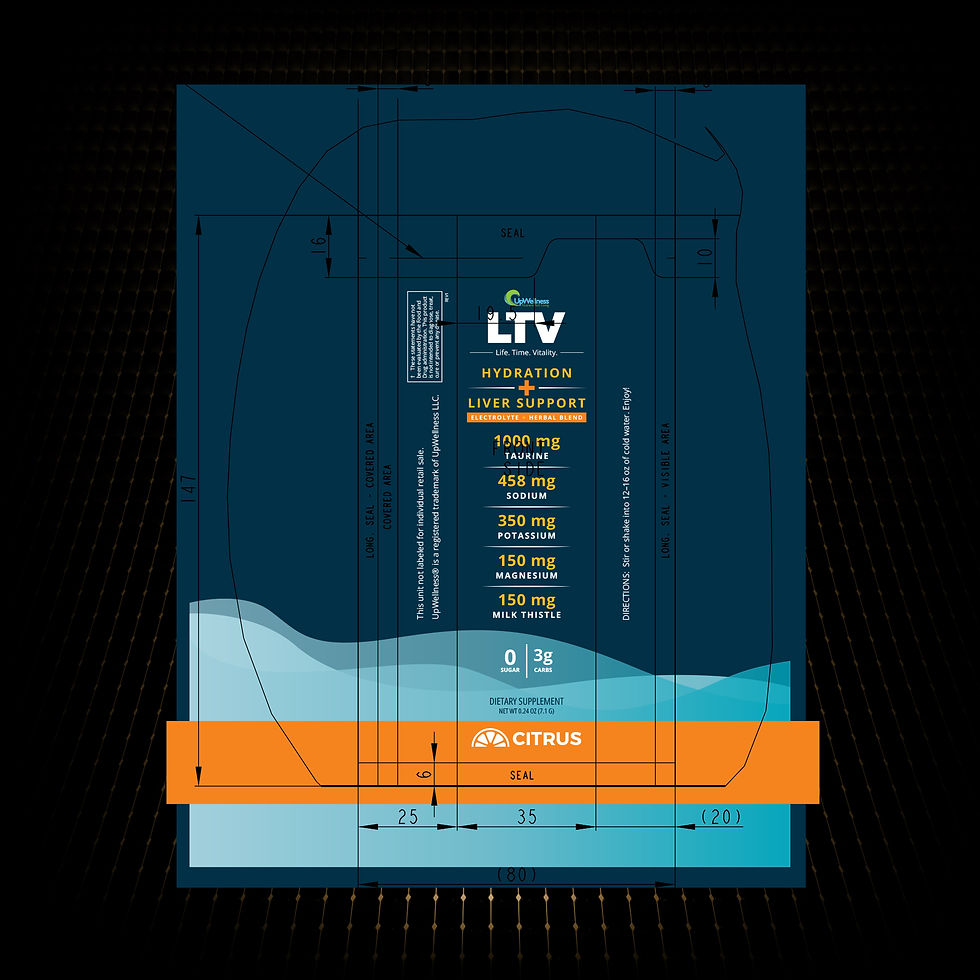
LTV’s packaging system unites pouch and stick formats through bold color, clear hierarchy, and custom iconography, creating a modern, approachable design that instantly communicates hydration and liver support benefits.
02 | CASE STUDY
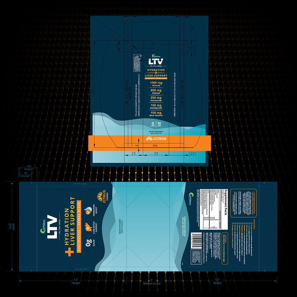
LTV PACKAGING
UpWellness developed LTV (Life. Time. Vitality.), a hydration and liver support supplement formulated as an electrolyte and herbal blend. I designed a modern, cohesive packaging system for both the pouch and stick pack formats. The challenge was to create a clean, professional look that communicates health and vitality while remaining easy to read and visually striking.
PROJECT OVERVIEW


OBJECTIVES
Design packaging that is modern, approachable, and functional, highlighting the product’s health benefits with clarity. The goal was to unify pouch and stick pack packaging so they feel like part of the same system, while ensuring important details (like ingredients and nutrition highlights) are clear to consumers at a glance.

PROCESS
-
Format & Layout: Built dielines for pouch and stick pack, using the pouch as the primary brand canvas and the stick pack for ingredient and nutrition callouts.
-
Color System: Dark blue and orange for strength and energy, with light blue tones to signal hydration—bold, modern, and highly legible.
-
Custom Iconography: Designed three benefit-driven icons (0g Sugar, Liver Detox Support, Hydration Boost) for fast, at-a-glance communication.
-
Typography & Hierarchy: Large centered logo with a clear information flow from product name to benefits, flavor, icons, and nutrition highlights.
-
Consistency Across Formats: Stick pack mirrors the pouch visually while carrying detailed ingredient information for functional single-use packaging.
OUTCOME
The final packaging is clean, modern, and highly functional. The pouch communicates overall brand presence while the stick pack emphasizes portability and nutrition details. Together, they form a consistent, trustworthy product line that highlights hydration and liver support benefits at a glance.

KEY TAKEAWAYS
-
Color Psychology: Blues for hydration, orange for vitality and energy.
-
Icon-Driven Communication: Quickly conveys core benefits without clutter.
-
Consistency with Flexibility: Same visual system applied to two packaging formats with slight variations.
-
Visual Impact: Bold, modern look that is easy to spot and read.


EXPLORE MORE CASE STUDIES


VIEW PORTFOLIO