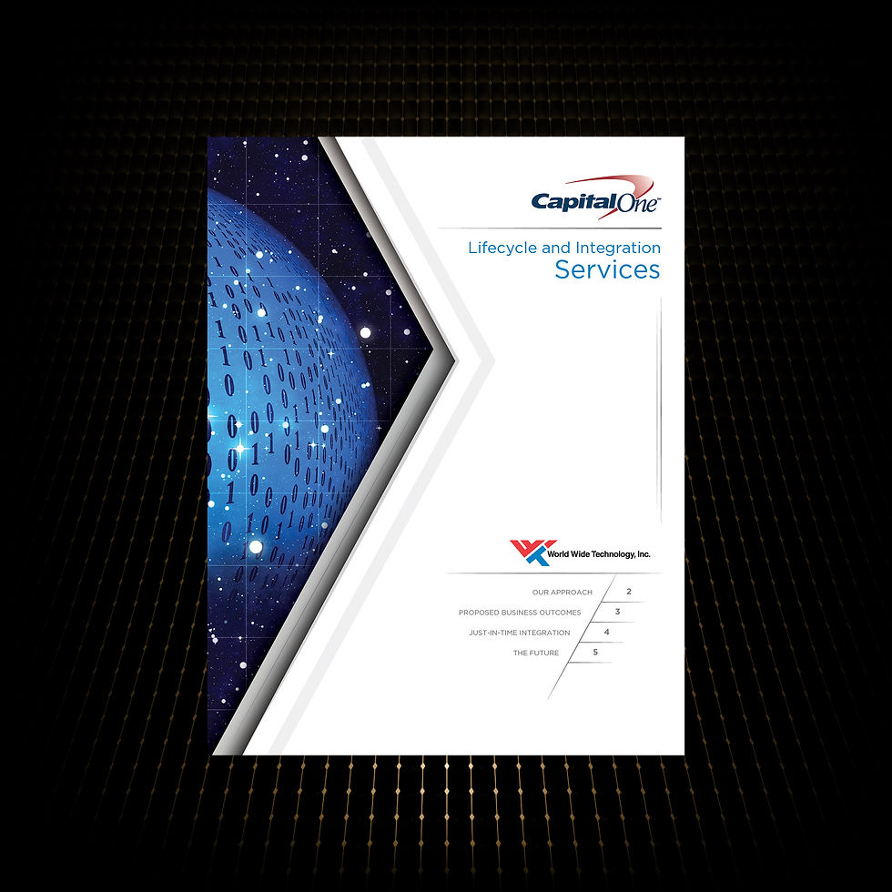
The WWT × Capital One pamphlet blends clean, futuristic design, structured content, and brand-aligned visuals to clearly communicate their partnership’s methodology, outcomes, and innovative approach to the financial industry.
05 | CASE STUDY
WWT / CAPITAL ONE
PRINT COLLATERAL
World Wide Technology, Inc. (WWT) partnered with Capital One to showcase their collaborative approach to delivering advanced technology solutions for the financial industry. To support this initiative, a thin, multi-page pamphlet was created to highlight the partnership’s methodology, outcomes, and vision for the future.
PROJECT OVERVIEW


OBJECTIVES
Design a sophisticated, easy-to-read brochure that:
-
Reflects WWT’s innovation and professionalism.
-
Clearly communicates the four key pillars of their approach.
-
Visually aligns with WWT’s brand identity and corporate partnership with Capital One.
-
Appeals to a financial industry audience by blending themes of money, technology, and trust.
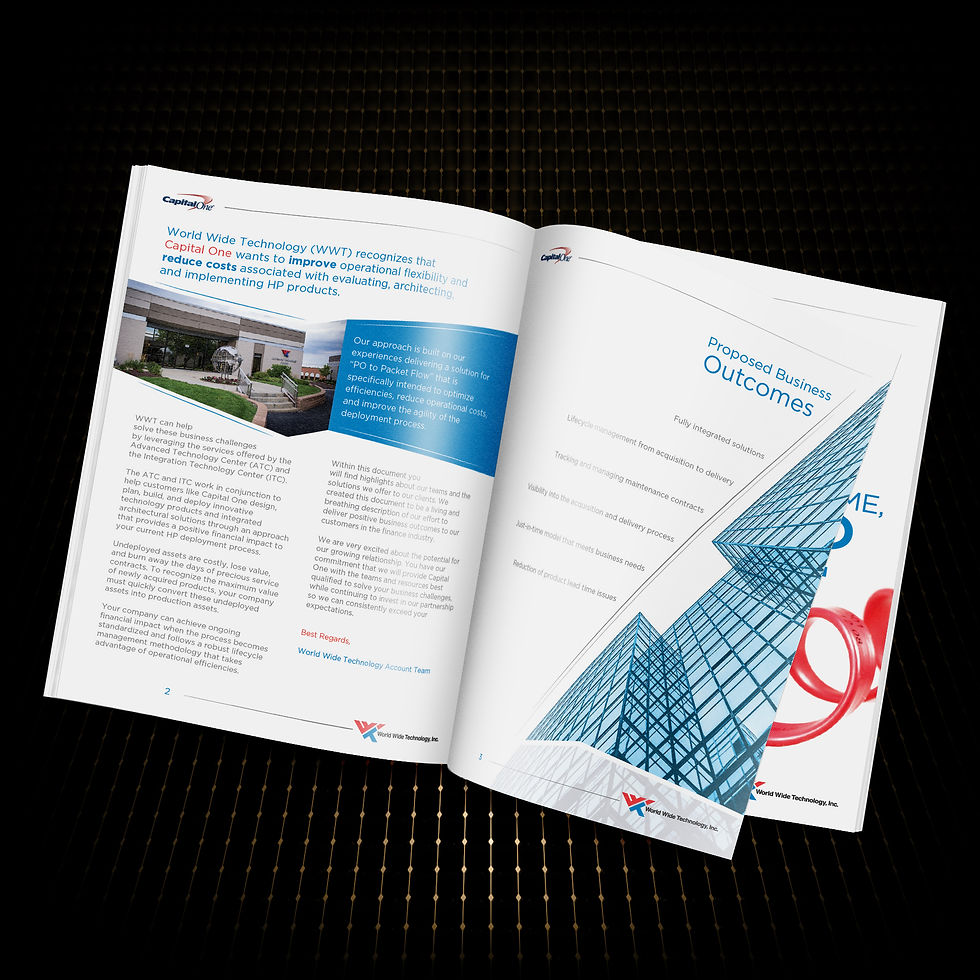
PROCESS
-
Structured content into four clear sections (Our Approach, Proposed Business Outcomes, Just-in-Time Integration, The Future) to guide readers from present strategy to long-term vision.
-
Designed flow for clarity and progression, making complex ideas easy to follow.
-
Created a light, clean, and futuristic UI with generous white space to enhance readability.
-
Incorporated abstract angles and geometric shapes to convey precision, movement, and progress.
-
Used subtle financial and technology imagery to reinforce context without distracting from content.
-
Aligned with WWT branding through its red and blue palette, modern typography, and a strong visual hierarchy.

OUTCOME
The final pamphlet delivered a professional, engaging, and polished communication tool that effectively highlighted WWT’s partnership with Capital One. The design emphasized trust and innovation, while the structure clearly articulated the lifecycle and integration services offered to clients in the financial sector.

KEY TAKEAWAYS
-
Clean and futuristic design elevated WWT’s message of innovation.
-
Red and blue corporate palette reinforced brand recognition and partnership identity.
-
Content clarity: Organized sections allowed for intuitive reading and strong messaging.
-
Sophisticated business feel ensured the piece resonated with executives and financial professionals.


EXPLORE MORE CASE STUDIES


VIEW PORTFOLIO